Bold, vibrant colour schemes are big news for kitchen design in 2018, with bright tones, strong shades and contrasting palettes adding visual interest and character to the heart of the home. Colour is a powerful design tool that can be used to alter the mood of a kitchen, changing the perception of the space, making it feel bigger and drawing the eye to particular features.
Vibrant colour schemes can work well in injecting personality into the space, with shades chosen for certain areas of the room. For instance, lighter and brighter tones are best for practical areas used for cooking, while darker, softer shades can provide a relaxing, subtler ambience for the area of the room dedicated to socialising and entertaining.
The colours chosen for the kitchen needn’t be bold for those preferring something a little more restrained, as pastel shades can also be used to great effect in line with this trend, particularly when used as a co-ordinating or contrasting finish. In fact, pastels are ideal partners for some of the most popular palettes of the moment, including grey tones and timber and stone effect finishes. Pastels can also be used for highlighting and creating features, to present a real wow factor in the modern kitchen.
Deep colours can make just as much of a design statement as brighter hues. Dark shades of blue, for example, are among the most popular kitchen colours of the moment and offer a versatile way of adding boldness and drama to larger spaces.
While colour blocking creates an individual look and add warmth to the contemporary or classic kitchen, ensuring the effect is not overbearing is important. In compact kitchens much colour or contrasting shades can be detrimental to the design, while larger, open-plan kitchens need to be planned carefully to ensure the chosen colourways create a comfortable ambience whichever task the room is being used for and whatever the time.
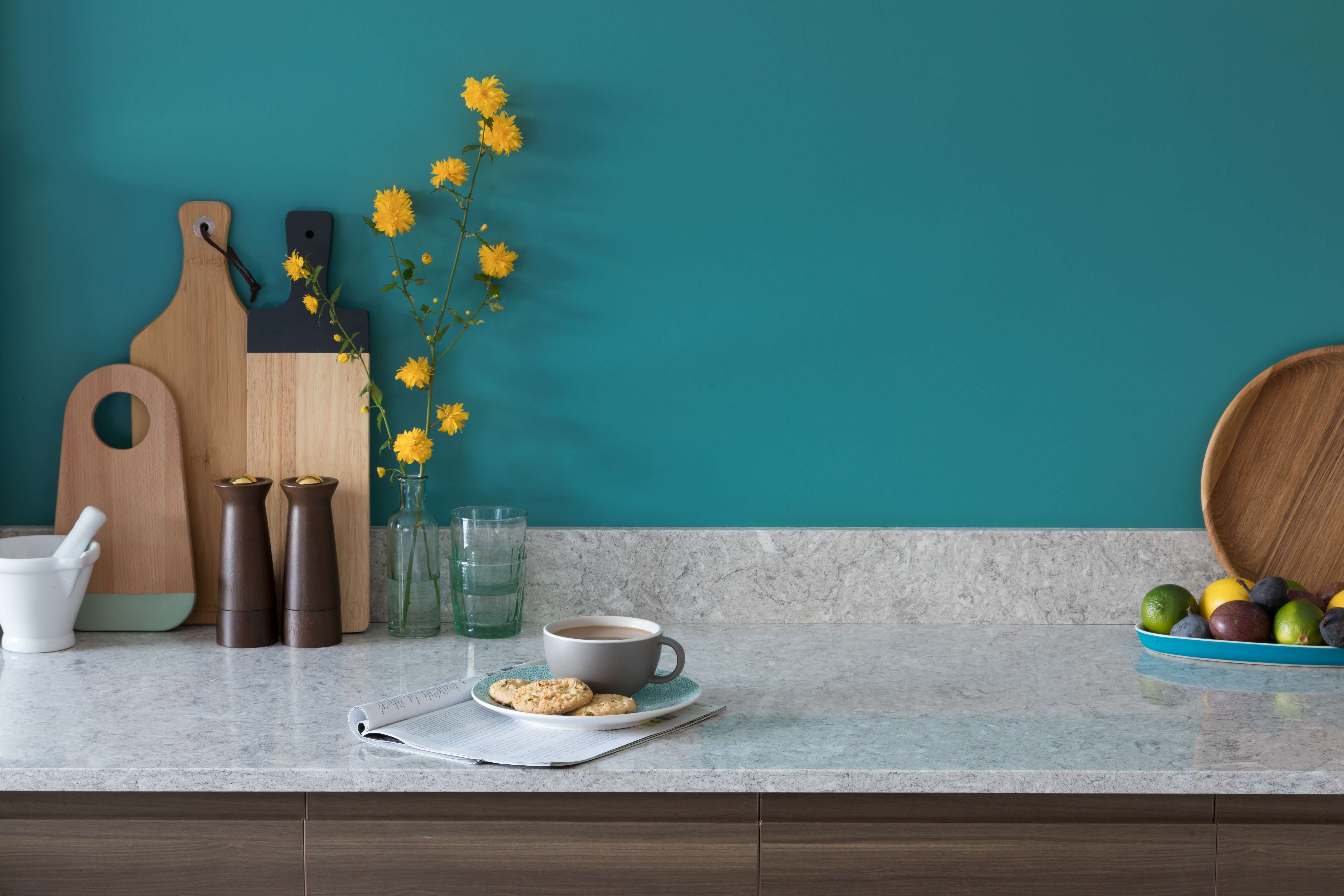
Careful worktop selection is an effective way of ensuring the right balance is created and choosing a surface that will work in harmony with any colour from light to dark is key. A grey worktop, for example, will soften the overall look of brighter shades, while working in harmony with a darker colour palette such as Royal Blue. Worktops in such neutral colours blend into the background and allowing the strong colours in the room to grab the attention. Similarly, a white surface creates a blank canvas for practically any colour scheme, brightening the space and leaving a crisp, clean impression.
Finish is important here too, with a natural or textured finish worktop tying in well with an industrial theme while adding character, which is ideal in light, bright spaces.
Whether chosen in contrast or to match the overall colour scheme of the kitchen, the worksurface will naturally draw the eye as it covers such a large expanse of space within the room, so make it part of your overall design and have fun with the latest trend for colour.
Request Brochure Request a Sample